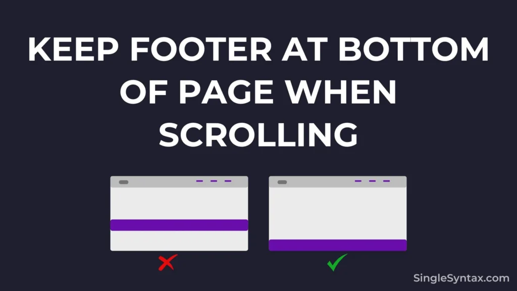
Do you want to know how to Keep Footer at Bottom of Page When Scrolling the web page?
If you recently created web page using HTML and CSS that also has a footer section, and you notice that the footer is not sitting perfectly at the bottom of the page.
AD
To fix this simple issue you can follow the steps that I have mentioned in this blog post.
Why Not Use position: fixed, absolute or CSS Grid for a Footer?
Position: fixed and absolute Issues
If you use the CSS position property, your footer will remain visible even when the user scrolls, which can negatively impact the user experience by potentially blocking important content on your webpage.
Most of the time, using the CSS position property can cause overlapping and scrolling issues, which negatively affect accessibility.
CSS Grid Issues
If you’re considering using the CSS Grid property, be prepared for extra work, as it can disrupt your site layout and require a complete restructuring.
AD
Using the CSS Grid property is not recommended as it may not work well in older browsers.
How to put the Footer at the Bottom of the Page?
Step 1: Choose the Right Layout
The first and most important step is to use the right layout for your web page because of you use something different then the CSS flex box may not work currently.
I recommend having header, main, and footer sections inside the HTML <body> element. You can also wrap them inside a <div> container for better structure.
Here’s the recommended structure:
<!DOCTYPE html>
<html lang="en">
<head>
    <meta charset="UTF-8">
    <meta name="viewport" content="width=device-width, initial-scale=1.0">
    <title>Simple Website</title>
</head>
<body>
    <!-- Header -->
    <header>
    </header>

    <!-- Body Section -->
    <main>
    </main>

    <!-- Footer -->
    <footer>
    </footer>
</body>
</html>
Also see: JavaScript Push Object to Array (5 Simple Methods)
Step 2: Set Minimum Height
body {
    min-height: 100vh;
}
Now, I will apply the min-height property to the body tag to make it span the full height of the webpage.
AD
This important step ensures that all empty space at the bottom of the page is covered when there is little content.
If you’re using a container wrapper, apply the min-height property to the container rather than the body.
Step 3: Apply Flexbox Direction
body {
    min-height: 100vh;
    display: flex;
    flex-direction: column;
}
I will again apply display: flex and flex-direction: column to the body tag.
If I don’t use these two CSS properties, margin: auto won’t work in the next step. Therefore, it’s essential to apply display: flex and flex-direction: column to keep the footer at the bottom of the page while scrolling.
Step 4: Use Auto Margin
.footer {
    margin-top: auto;
}
Finally, add the last CSS property to the footer tag: margin-top: auto;. This will create a top margin for the footer section.
The advantage is that margin-top: auto will be applied automatically, if there is less content, more margin will be added, and if there is more content, less margin will be applied.
Now, when you view your HTML page, you’ll see that the footer stays perfectly at the bottom without disrupting the layout or blocking important content.
Here is a live preview of the code on CodePen.
Conclusion
Following these four steps ensures a well-structured and responsive layout. By choosing the right layout and setting min-height: 100vh;, the page maintains a proper height even with little content.
Using a flexbox with a column direction allows elements to stack naturally, and margin-top: auto; ensures the footer stays at the bottom without overlapping content.
This approach improves both usability and accessibility, creating a smooth user experience.
If you know of a better method, feel free to share it in the comments! I’ll update this blog post to include your suggestion so others can benefit from it as well.
If you like this blog post then you may also be interested in Javascript Show/Hide Div onClick [Guide with Code], How to Validate Form in JavaScript Before Submit? [Simple Steps], How to Disable HTML Code Without Deleting? (6 Methods).
For more amazing coding tips and tutorials, subscribe to our YouTube channel.
